Cool Product Packaging We Thought to Share…
If there’s one thing we’re learning from the social media boom of recent years, it’s the value of a buzzworthy Instagram post. You want to make an impression. You want that photoset of your latest work to be liked and shared a thousand times and featured on The Dieline.
Cool product packaging makes a product desirable, it sparks interest. You might not spend as much time fantasizing about packaging as we do, but we bet you’ll like the fads we’ve spotted.
Here’s our take on three highly Instagrammable trends in packaging that you should know about.
Natural patterns
Earth-inspired patterns are the definition of cool product packaging. Minerals and woodgrain are donning just about every conceivable surface from water bottles to leggings to phone cases and packaging has not been spared from the craze.
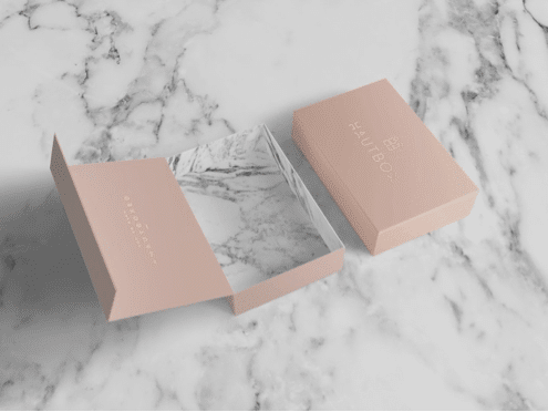 Marble printed lining creates a luxurious surprise experience.
What makes this style of packaging so cool is the sensory fake-out. It’s sort of delightful to handle a box with realistic marble print that has the weight of paper when your instincts say it should have the weight of stone. For natural, ecofriendly brands, a rustic aesthetic is a surefire way to connect with customers. A wooden look adds a crafty, handmade element to the packaging. A company like KIND which emphasizes simplicity and natural ingredients is a perfect match for natural patterns.
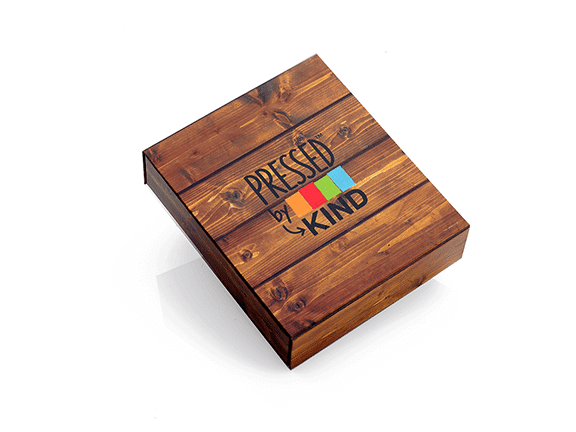
Woodgrain printing communicates an ‘organic’ or ‘natural’ ethos for KIND Bars.
Rigid paperboard is conducive to cool product packaging in all its forms. The stripped-down crafty look of wood is gloriously achieved with a little help from specialty printers. Ditto for elegant stone prints. You don’t need to be a master mason to capitalize on the success of earthly patterns. Paperboard has possibilities.
Laser focus
So you want an impossibly intricate design cut into your packaging with maximum accuracy? Well, you’re living in the right century. Advancements in laser technology have allowed for decorations to be cut in incredibly complex patterns resulting in some truly cool product packaging.
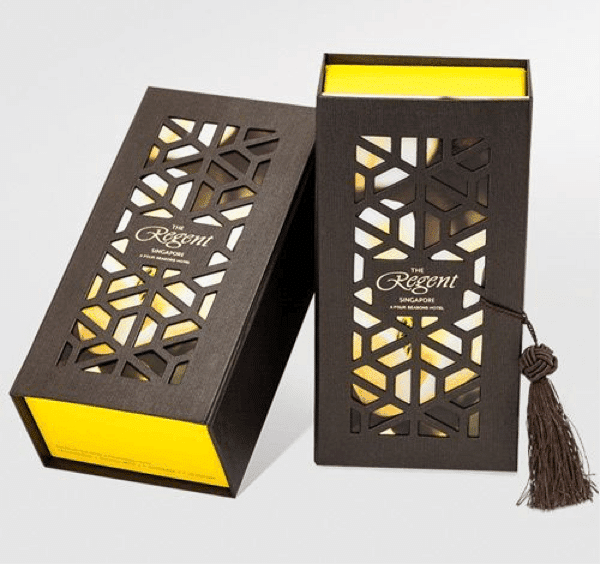
This manufacturing innovation has brought about more decorative flexibility than could be achieved with traditional die-cutting. Laser-cut accents bring texture and depth to packaging. It demands to be touched, inviting the audience to indulge their tactile desires and handle the piece. When technology and creativity meet, it’s a win for cool product packaging.
Impact minimalism
Is there something wrong with a solid color and a bold typeface? Evidently not.
By now, you’ve probably heard of Van Leeuwen, the Brooklyn-based ice cream makers who increased their profits by a whopping 50% after changing their packaging design. By making their logo the focal point and selecting a palate of creamy pastels, the Big City confectioners became Instagram darlings with their cool product packaging.
Take a look at those pints. Let it sink in. What’s the takeaway?
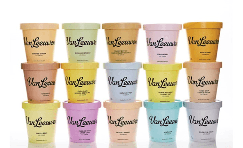 The simplicity of the design adds emphasis– nothing to distract your eyes!
Highly readable, identifiable, and easy on the eyes. The perfect formula for a social media phenom. When was the last time you snapped a picture of the freezer at your bodega? This cool product packaging resonated with consumers because it was a break from the graphic-heavy designs that dominate the packaged ice cream market.
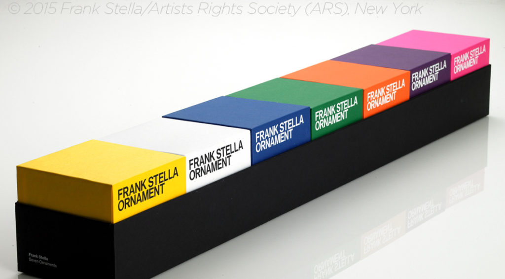
Our packaging for Frank Stella’s Holiday Ornament is a similar breed. Relying on sheer color and font, the boxes make a bold statement. The palate is brighter, the text more forceful, but the rule of minimalism holds true.
The common denominator of all these trends is impact. They make an impression worth posting about. Keep it simple and do it well, because there’s quantifiable evidence that it pays off.