Would you rub snake venom on your face for the sake of beauty? How about dragon’s blood? …Bee venom?
Rodial CEO Maria Hatzistefanis is well aware of the frightening names of her products, but it hasn’t stopped her company from becoming one of the leading brands in skincare. Beginning as a humble startup in 1999, Rodial has since ballooned into one of the world’s most popular beauty brands . With beloved products and a litany of celebrity endorsements (hey, Kylie Jenner) Rodial exemplifies the epitome of luxury in the beauty and skincare market. British creative agency Page Creative came to us with a stunning packaging design for Rodial. The tray in five panel folder design commands attention with an undeniable allure- snake venom and all.
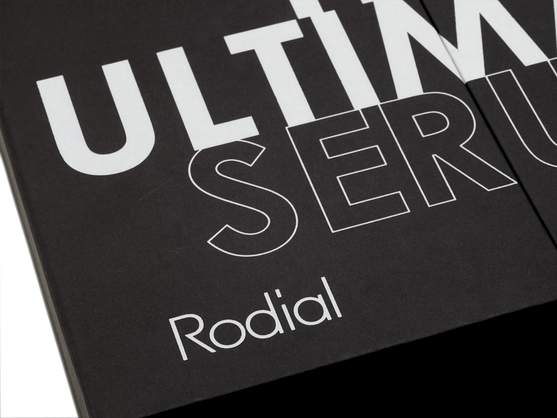
We’ve made a lot of luxury beauty packaging at Pusterla Box. Between our experienced hand-department, foil stamping, and die-cutting departments, our internal capabilities are perfectly suited for creating bespoke, handmade boxes that evoke a true luxury feel. It’s the materials, the execution, and of course, gorgeous packaging design devised by stellar agencies like Page Creative. When great design aligns with devoted manufacturing, the results are bound to be exceptional.
Page Creative prides themselves on providing London quality design services without the London attitude. With an impressive portfolio of brand-defining, awe-inspiring packaging projects, it’s no surprise that Page Creative’s design for the Rodial Ultimate Serum Edit Box was an absolute winner. It all starts with the first impression.
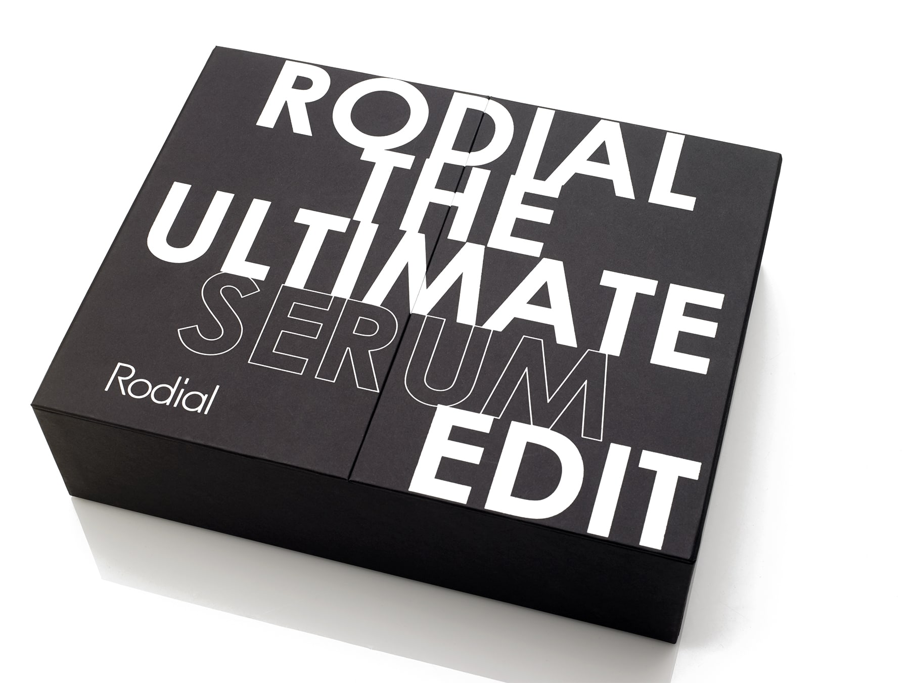
Oversize sans-serif typeface makes for a bold introduction when first encountering the box. The branding is decidedly modern, harnessing the dimensional properties of the box to invite beholder to open it. The lettering is deliberately split between two panels, so when the box is opened, the beholder first passes through the name of the product itself. It’s a spare design that emphasizes the product by virtue of name alone. No extraneous elements in this luxury beauty packaging.
The lettering decoration on the front of the box was accomplished by our incomparable foil stamping department at our facility in Warren, RI . This design involved a fair amount of foil to, er, stamp, and the precision and consistency across each piece is a testament to the talents of our shop.
Upon handling the box, it’s easy to see why this project was coined a “wardrobe” box. The two front panels open on paper hinges flanking either side, something like the effect of a kitchen cabinet, or say, a wardrobe. This design is particularly effective in combination with the foil stamped decoration, forcing you to interact with the words as you experience the packaging, making a connection between copy and product. If that’s not a great mnemonic device, what is?
The luxury beauty packaging experience comes to a climax inside of the box with a slew of features.
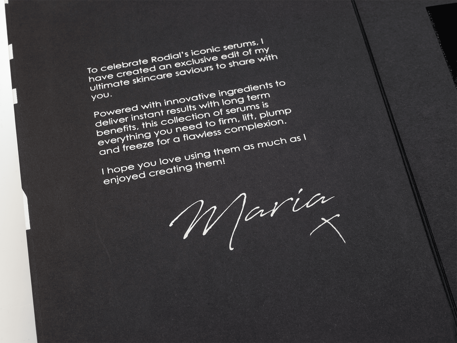
On the inner panels, there’s pertinent product info and a thank you from CEO Maria Hatzistefanis. Even the delicate, tiny letters of each paragraph are rendered in impressive clarity by our foil stamping department. In standard beauty packaging, this might be information you would find on the back of the box, but here, economizing the ample space on the reverse side of the front panels, it appears as a feature on the inside of the box.
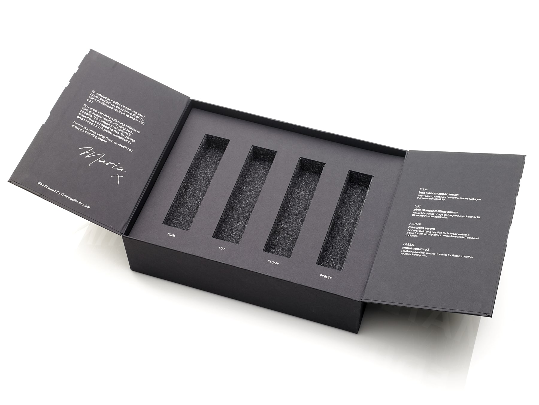
A custom foam insert is the defining feature of the interior, die-cut to specification at Pusterla Box. Four bottles of coveted Rodial serum were destined to grace this box, each serving a different cosmetic purpose. The foam serves the dual function of protecting the products and preventing them from traveling within the box.
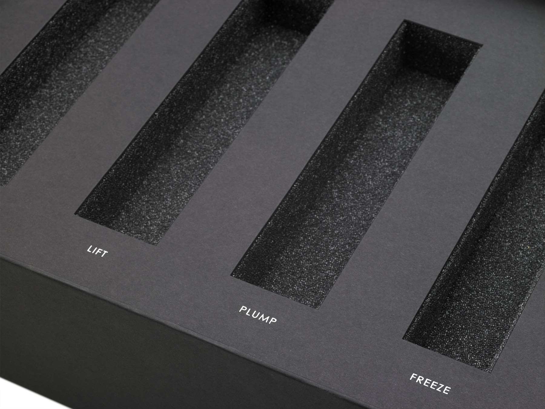
Finally, a magnet closure adds one last touch of luxury to the packaging experience. A magnet closure provides a sense of security, and really, the simple assurance that the front panels of the box won’t randomly swing open at their own behest. From a tactile perspective, magnets also imbue the packaging with a sense of quality. The slight sense of resistance when opening the box signals that this is a grade above the average department store packaging.
This box features two of our most frequently used suppliers, Ecological Fibers and Eska. It’s difficult to describe Eskaborad as anything but the sturdy, reliable basis of structural packaging that it is. But besides being an exemplary packaging material, Eska is also a world leader in sustainability, uncommonly committed to a closed circle of production in their manufacturing process. And that environmentally concerned attitude is echoed in the business of our Rhode Island neighbors, Ecological Fibers. Here, Rainbow 80 Paper in Eclipse adorns the box; a dense, pleasing paper that is well-suited for luxury beauty packaging.
The Rodial Ultimate Serum Edit is a box that is completely congruent with the beauty it purports to represent. With a winning design by Page Creative as the basis of the packaging, creating a show-stopping luxury beauty box was a sure thing. Everything about this box cues the beholder to a premium packaging experience that reinforces the purchase. Quality materials that protect the contents as much as they accentuate them. Intricate decorations accomplished by seasoned packaging professionals. A recognizable brand with design by a renowned agency. A brand-defining packaging experience that radiates beauty.